2016-10-17
This link leads to an Excel spreadsheet that allows you to play with ROC curves. Here is what it looks like:
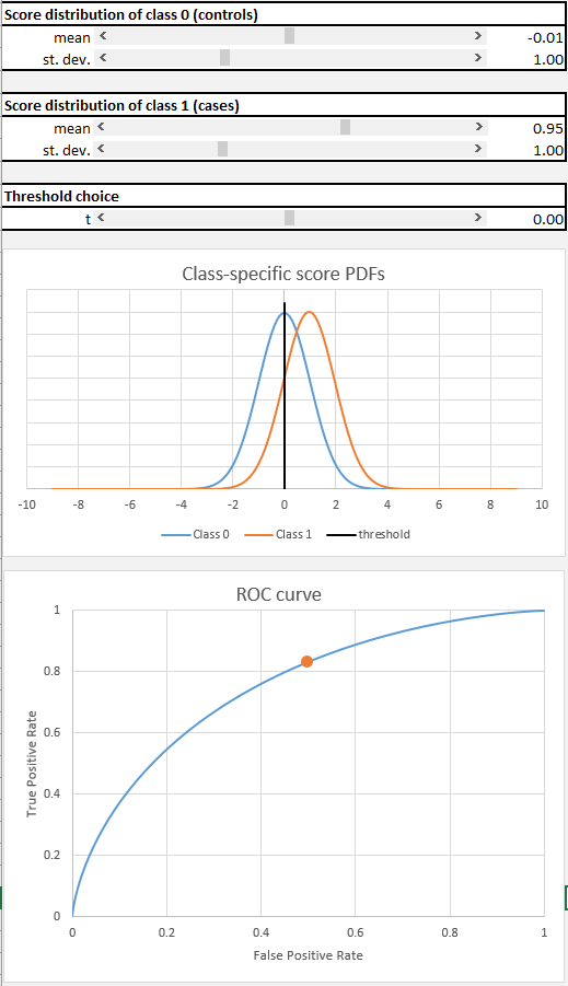
The sheet helps to understand ROC curves by considering the process that generates the curve. We have two categories or classes of items, and a classification method that assigns scores to items. It is hoped (in order to have a successful classifier) that the score distribution will be different depending on which class the items come from. The spreadsheet helps you explore how these score distributions influence the ROC curve’s shape.
Of course in real life we don’t know the score distributions, we just obtain the scores by using our favorite classification rule. Typically the ROC curves aren’t nice and smooth like these.
Why did I use Excel to do this? Simply because it was convenient. This was done very quickly as a lecture aid. Apologies to those who don’t have MS Office. There are other such tools available online for improving your understanding.
By the way, if you want to work with ROC curves in R, there are many packages. I have briefly used pROC, and it seems convenient and full-featured.